ConceptProperty
Hearthstone
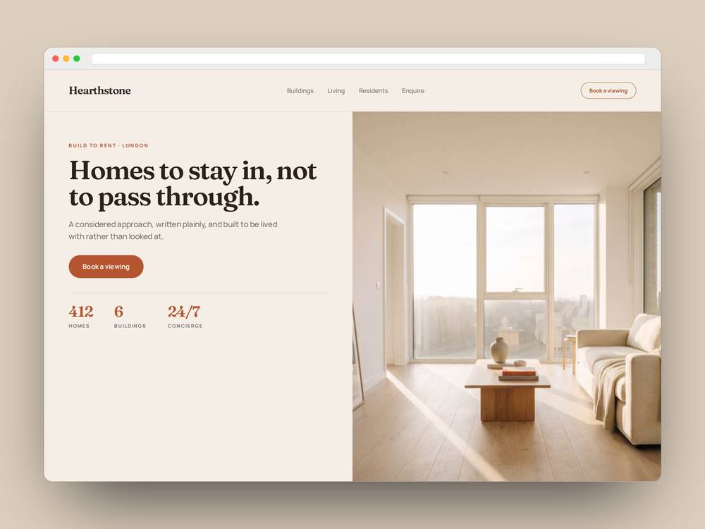
Identity and site for a build-to-rent operator. Warm and residential, deliberately unlike a corporate landlord.
FrauncesDisplay
EditorialLayout
WarmPalette
The brief
A self-set brief: build-to-rent is sold like a product and lived in like a home. Most operator brands sound like asset managers. What would one sound like if it sounded like somewhere you live?
What we found
- 01The category defaults to glass, chrome and stock photography of couples laughing on balconies.
- 02Residents are treated as tenants in the copy and as customers in the marketing, which reads as dishonest.
- 03Nobody publishes what living there is actually like day to day.
What we made
Positioning and narrativeFraunces and Manrope type systemWarm neutral palette with terracotta accentEditorial homepage designResident-first content structure
A note on labelling
Self-initiated. Hearthstone is not a real company and nobody commissioned this.
Want this done for your business?
Start with a free Diagnosis. Send your website address and a line about what you do, and you get a written list of what is costing you money within 48 hours.
Book a free diagnosis →